Behind the Photos: Capturing the Sex Edition
Evergreen photographers have interesting time illustrating Sex Edition topics
RYAN PUGH | Evergreen Photo Illustration
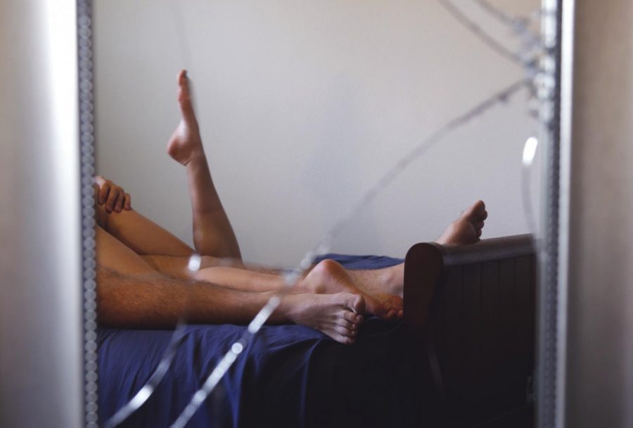
The original cover idea for Uncovering Sex Superstitions involved broken glass.
October 17, 2017
No matter how busy they are with regular newspaper assignments and homework, the photographers start asking when Sex Edition photos will be pitched roughly five days into the semester. As artists, it’s our favorite edition to put out for you guys. We get to dig deep into our creative souls to produce some truly symbolic and illustrative photos of all things sexual. Which, for a bunch of artsy college students, seems like a dream come true. Getting paid to place lipstick prints all over a mirror? Act out an orgasm? Pose in nothing but your lingerie with a polka dot umbrella? Sounds like a good time.
This year was a bit of a challenge though. Sexy superstitions? We wanted to veer away from taking boring shots of bras, alcohol bottles and feminine hygiene products. We wanted to push the envelope and get away with illustrations that perfectly encapsulated what our reporters were discussing while being as evocative and sensual as we all know sex should be. Brainstorming begins the minute the theme is known, but the nitty gritty work started when the entire Evergreen staff got together to pitch and pick up assignments. By the end of that meeting, I could already see my photographers eyeing the shoots they wanted, and Gabbie and Madison had barely concluded before they were scrambling to claim assignments.
The photo editors have a pretty laid back approach to assigning Sex Edition shoots. If you want it and are comfortable with the topic, then it’s all yours. Sometimes we would brainstorm with the photographers before sending them off to find models and buy any toys or props they needed, but most the time we trusted them to balance artistic inspiration with a dose of maturity. We gave them two weeks to get their shots and then the real fun for the editors began.
Photo editors Rachel Sun and Teva Mayer sat down and went through every uploaded assignment, laughing when we recognized one of our photographers as a model and cringing when the shots we flipped through were a bit more … illustrative, shall we say, than we imagined. Reshoots were doled out for the assignments that hadn’t done so well the first time around, often coupled with another brainstorming session.
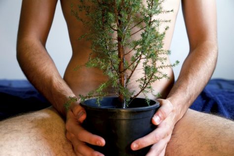
The morning wood assignment had us really at a loss. When was it too much of a photo illustration? Could we push our photographer to be more creative? Turns out we could, and what we got back from the reshoot was everything a clever morning wood photo should be.
Planning the cover for the Sex Edition is a process in itself. Teva worked closely with photographer Ryan Pugh to get a shot that played on widely known superstitions (An open ladder? A broken mirror? How ’bout an umbrella open inside?). Many things had to be considered: It couldn’t be too Halloween-oriented (yes, there was a conversation involving pumpkins and ball gags), and it had to be sexy (lingerie, lingerie, lingerie).

One of our photo editors’ favorite photo illustrations of this edition: A literal take on morning wood.
Our original cover really played off the broken mirror superstition, but had too many elements, and the sexual act classily reflected back at the viewer was lost in the details. The final version was everything a good photo illustration should be: simple, every detail considered (size of umbrella, color of umbrella, color of lingerie, pose, lighting, time of day, camera distance and focal length, moon cycle, horoscope, planet alignment, etc.) and the theme obvious.
The hard part really starts now, as we get the photographers to focus on the rest of this semester’s photos before asking about the next Sex Edition.
Working at the photo desk presents its own array of challenges on a day-to-day basis. Whether we’re trying to find a photographer to shoot photos last-minute at an event, or create a photo illustration for an obscure topic, we’re faced with the obstacle to present visual representations of subjects that are serious, difficult, silly or just plain weird.
At no time during the semester are these challenges more pronounced than in the bi-annual Sex Edition. Photo illustrations need to clearly, accurately and respectfully convey the message behind articles that can be obscure or sensitive. Questions about how best to represent a subject range from serious (How does one visually represent asexuality in a respectful manner?) to laughably awkward (How do you represent morning wood without … um … well, you know).


